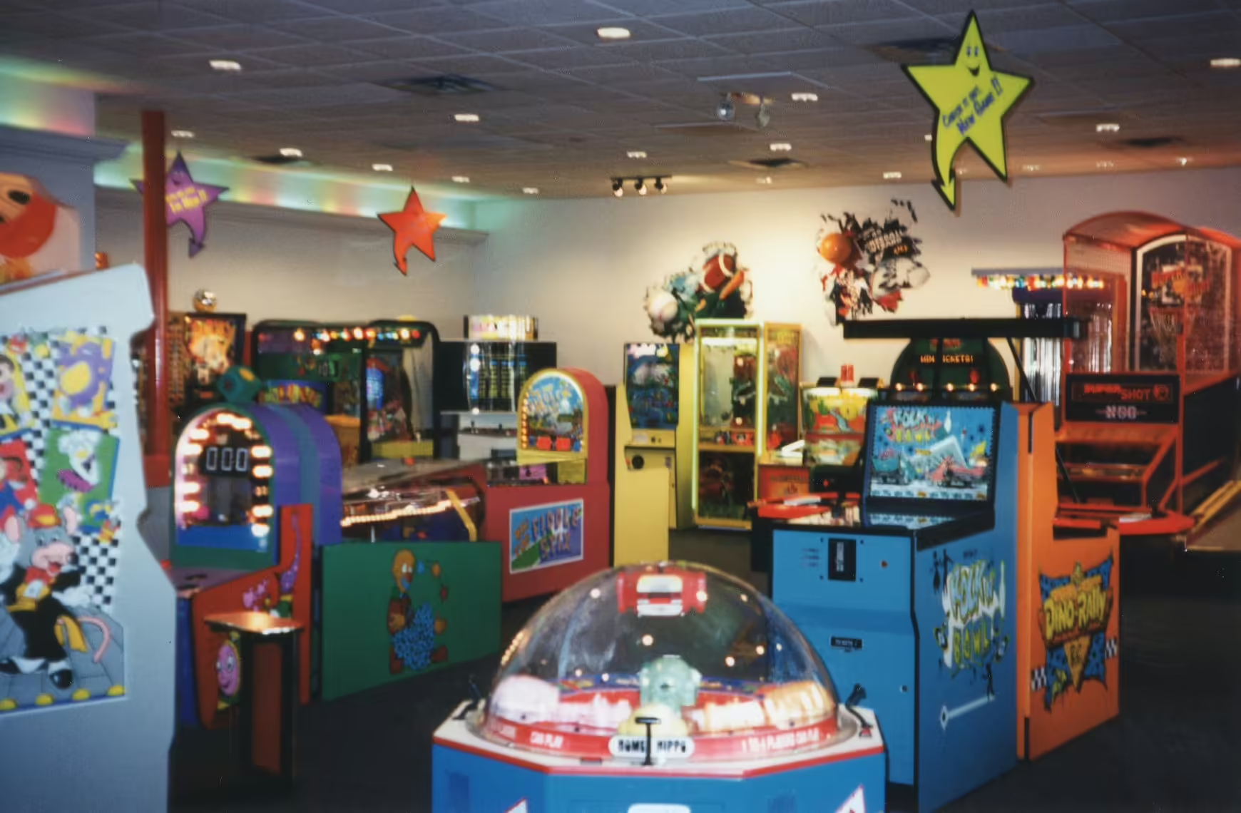
SPT 1990's Remodel Program
The SPT 1990’s Remodel Program was a company-wide initiative driven by ShowBiz Pizza Time to refresh the Chuck E. Cheese’s brand and increase profits amongst its locations. This remodel initiative is commonly and incorrectly referred to as Phase 1 (1994), also known as Operation Thumb Chuck, Phase 2 (1997), and Phase 3 (2000), which were instead game and entertainment packages that came with a remodel if it was not already completed. (1)(2)
History
In their 1993 Annual Report, ShowBiz Pizza Time announced a growth in revenue but a slump in sales across existing restaurants as opposed to new locations. [5] At this time, the company finalized Concept Unification, and adopted the “Chuck E. Cheese’s” name for all locations, partnering with the J. Walter Thompson Agency of Chicago to roll out new and marketing campaigns in February 1994. In the report, the company expressed plans to introduce new games and rides in the fiscal year 1994, along with initiatives to update the guest experience through “a rework and upgrade of our prize merchandise area.” [1] ShowBiz Pizza Time also introduced many upgrades to the guest experience separate from the remodel initiative, which includes Kid Check, Toddler Zone, and the “phased” packages. However, it should be noted that the introduction and updates of these fixtures were not tied to the remodel initiative, and instead were upgraded on their own or introduced through a new store opening.
Enhancements
The “CEC 1994 F.Y.I. Video” which was given to all locations provided insight on the upcoming changes within new and existing locations.[3] According to the Director of Design, Doug Hailey, in an interview with Duncan Brannan:
The best thing we’ve got going for us now is that we’ve moved to a real contemporary look… we’ve gotten a lot brighter, a lot lighter… we’re doing a lot of lighting effects in the store now, it’s a lot more of an exciting environment than it was before.
According to the Director of Facilities, David Hurst, in an interview with Robert Gotcher:
I’m really excited about the opportunities this year to update some of our older stores… it’s been a real challenge of the company to come back this year and invest our money wisely and try to get some growth out of our older stores that have been neglected somewhat over the last few years.
Exterior
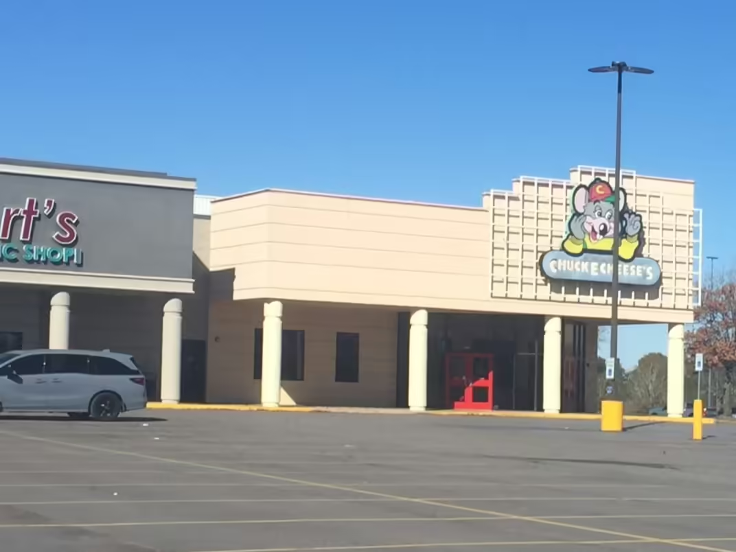
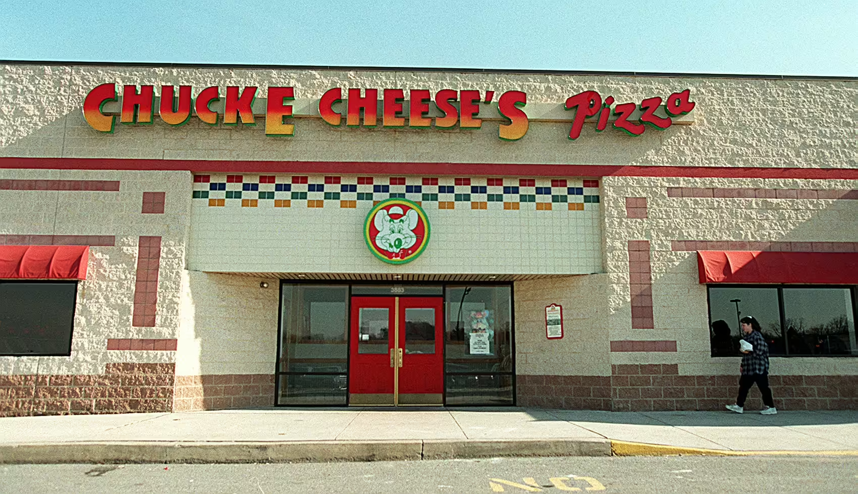
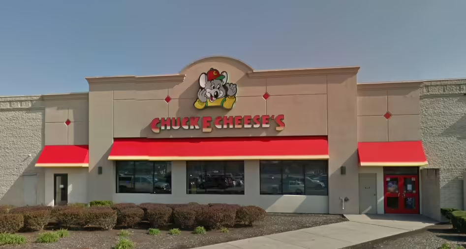
Most locations that received the remodel dropped the “Chuck E. Cheese’s Pizza” logo for the updated “Thumb Chuck” logo, which said “Chuck E. Cheese’s” to align with current branding. Exterior checker patterns over windows were hidden by red awnings which had a yellow border. The lettering for “Chuck E. Cheese’s” was a red and yellow gradient, and the logo fixtures had a vibrant green trim.
Interior
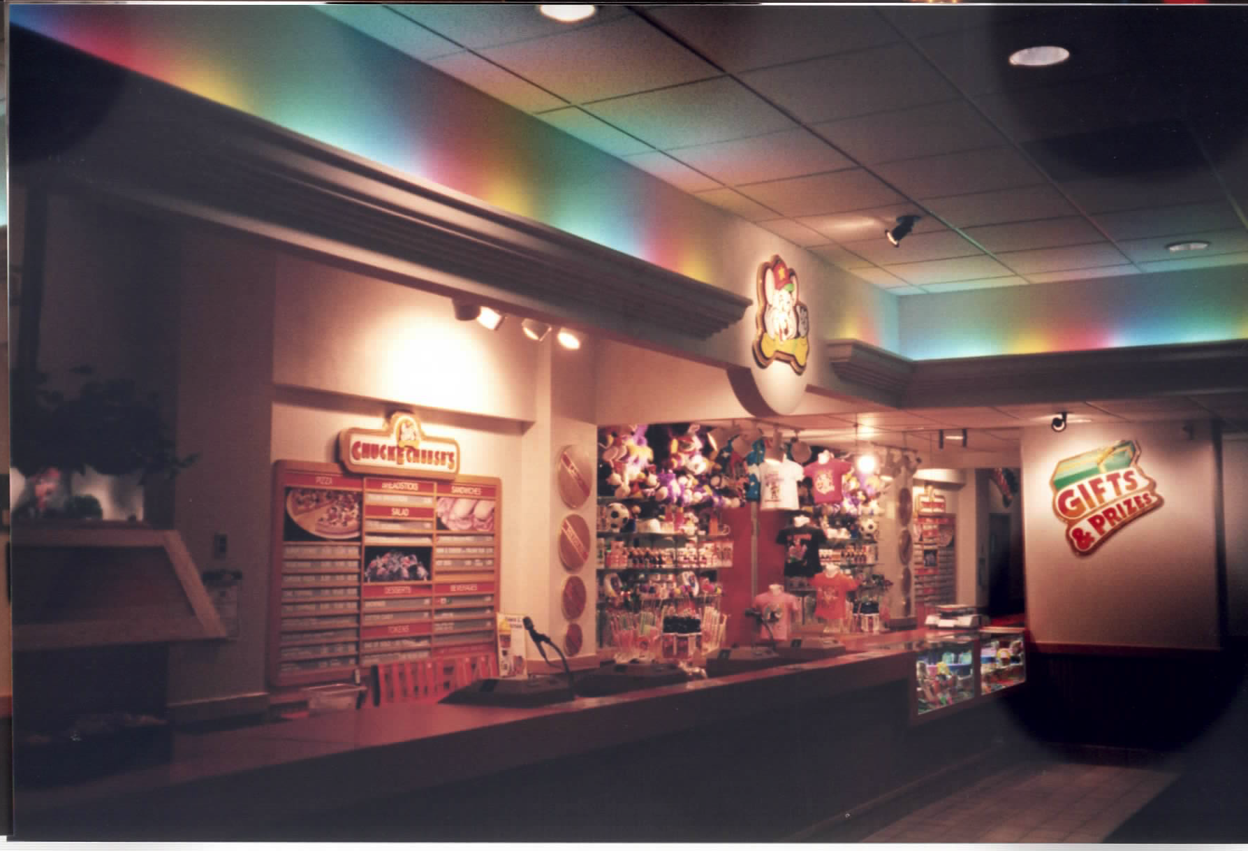
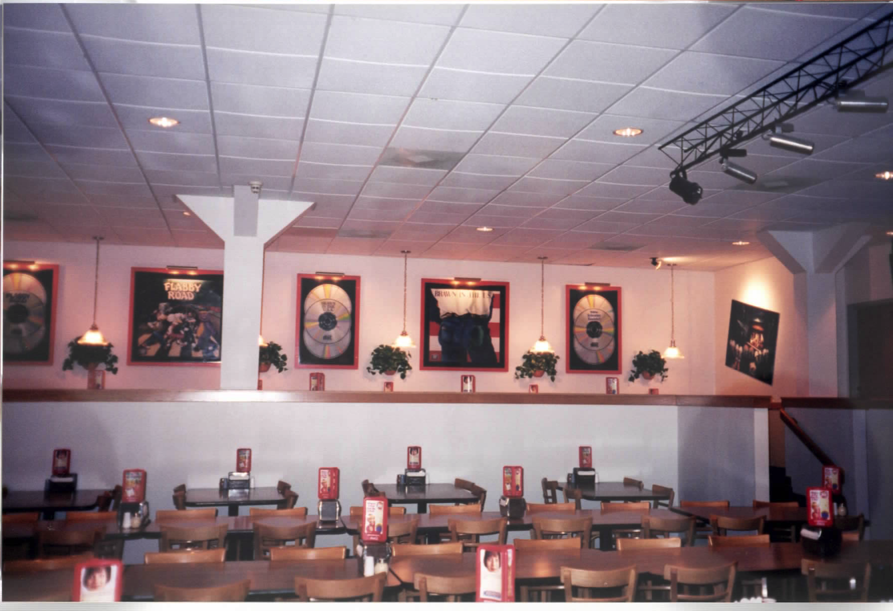
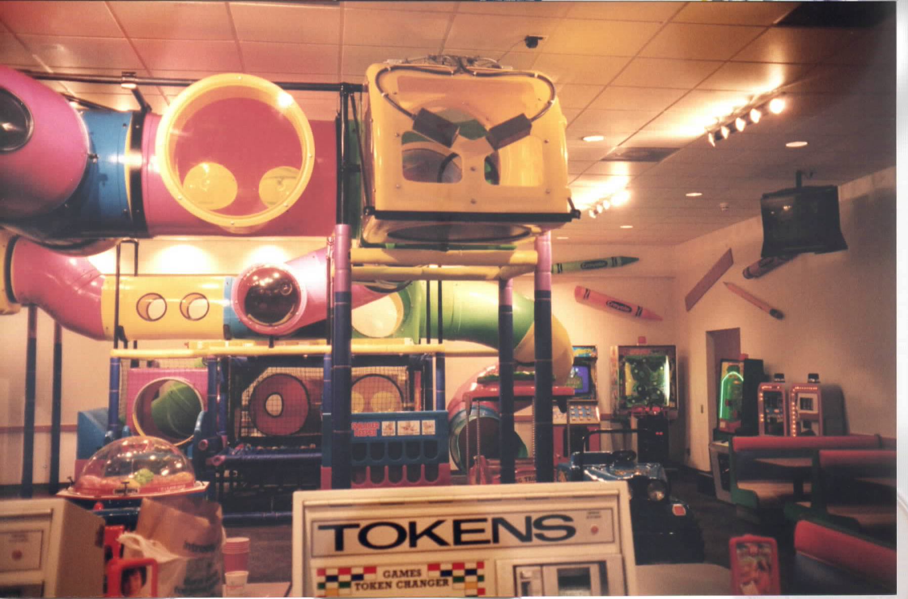
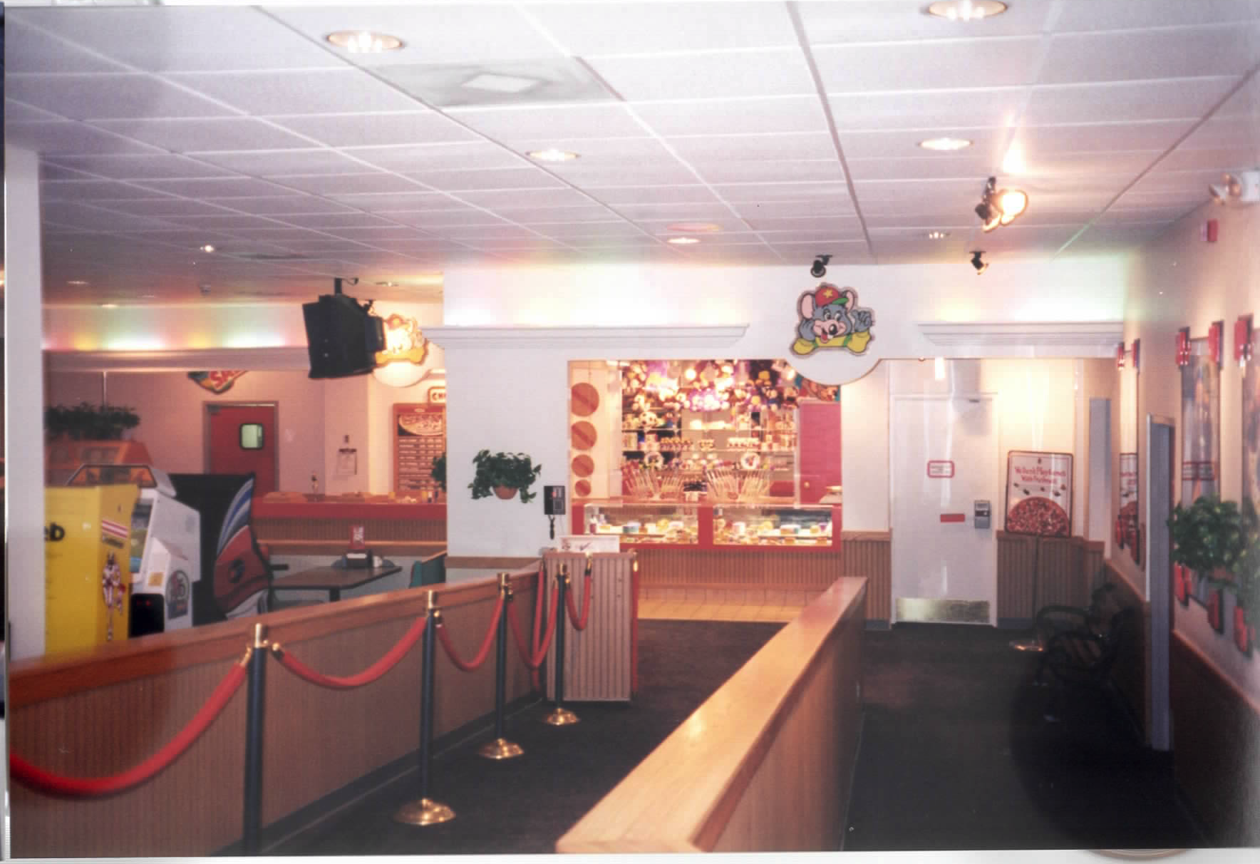
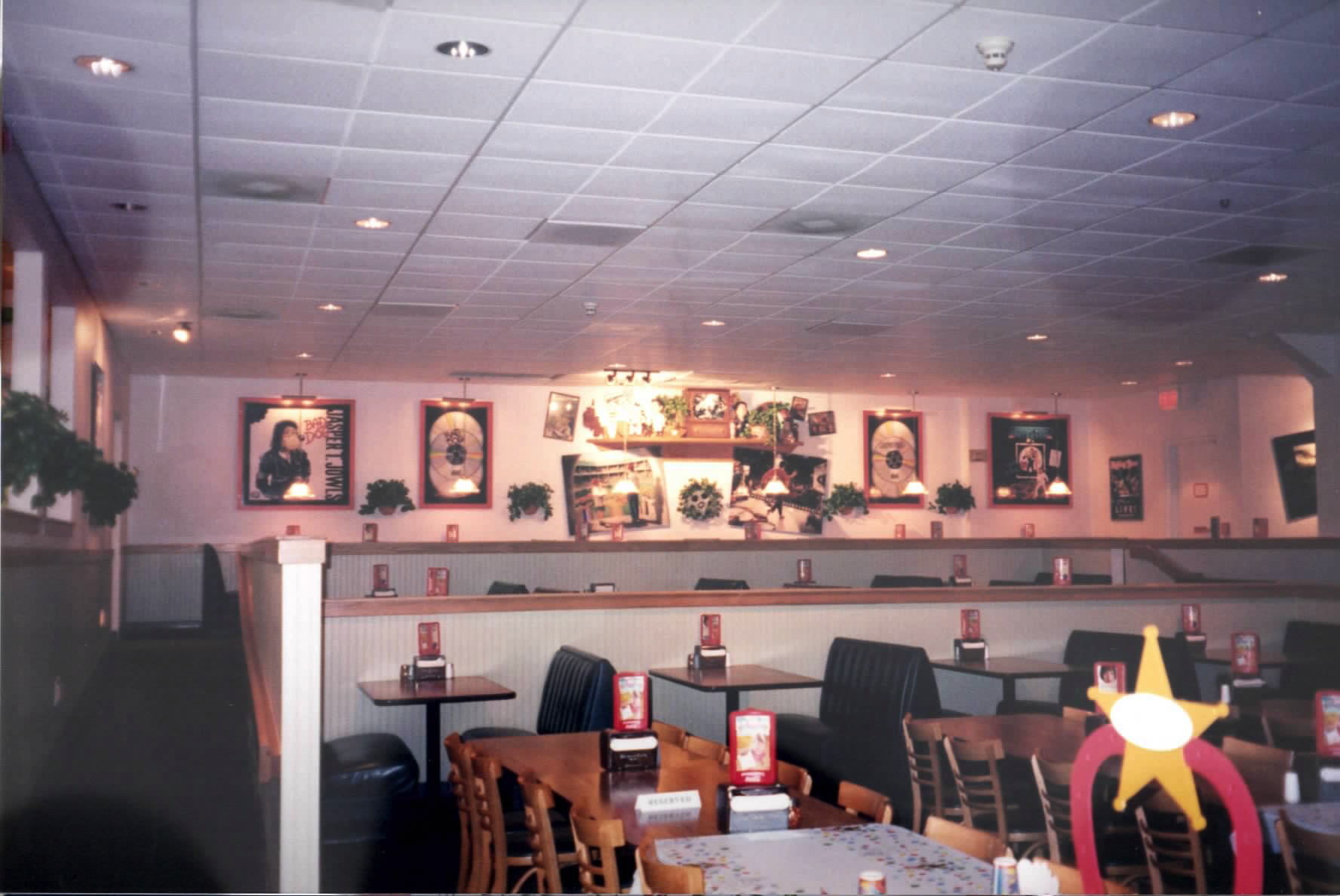
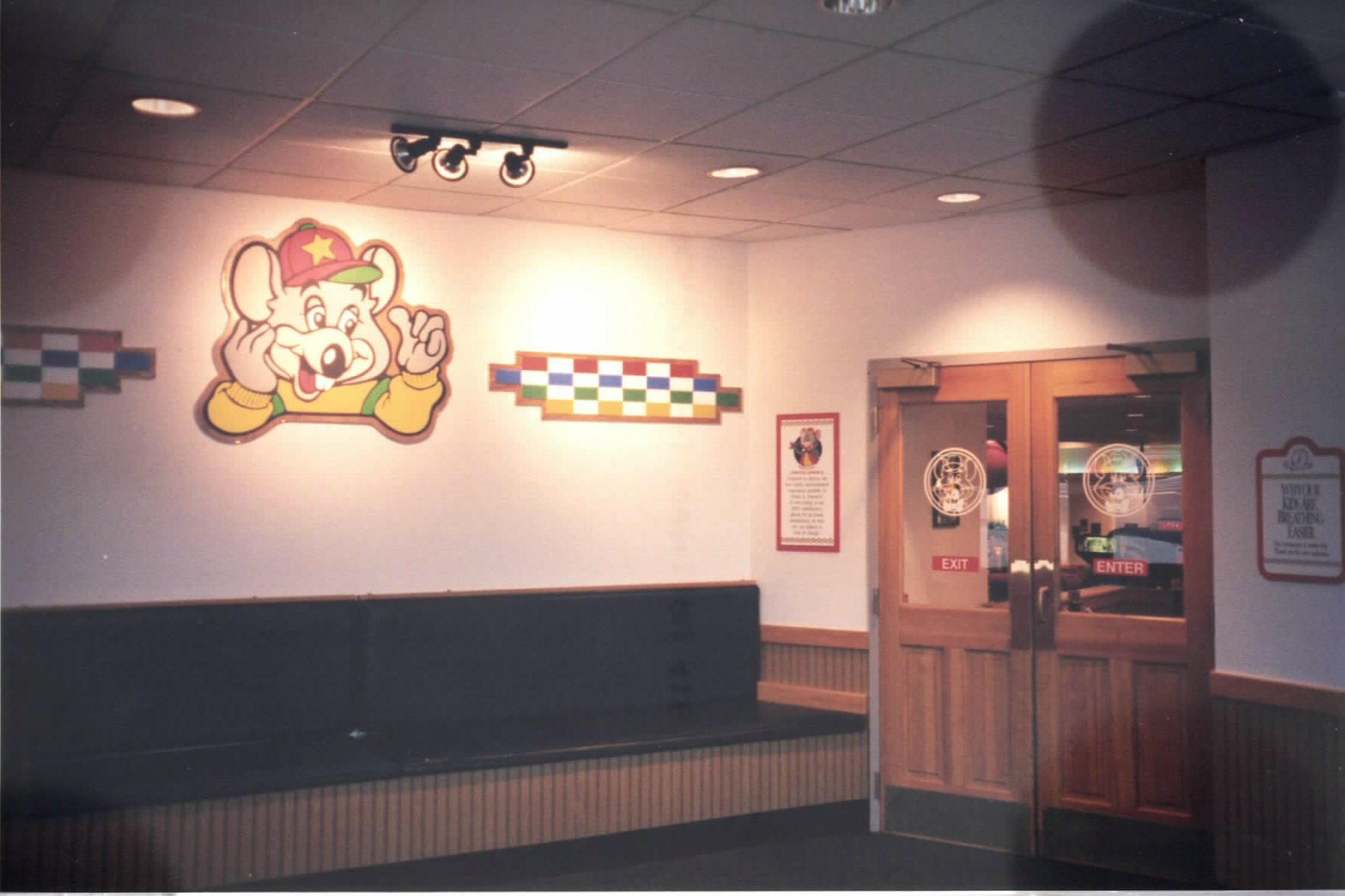
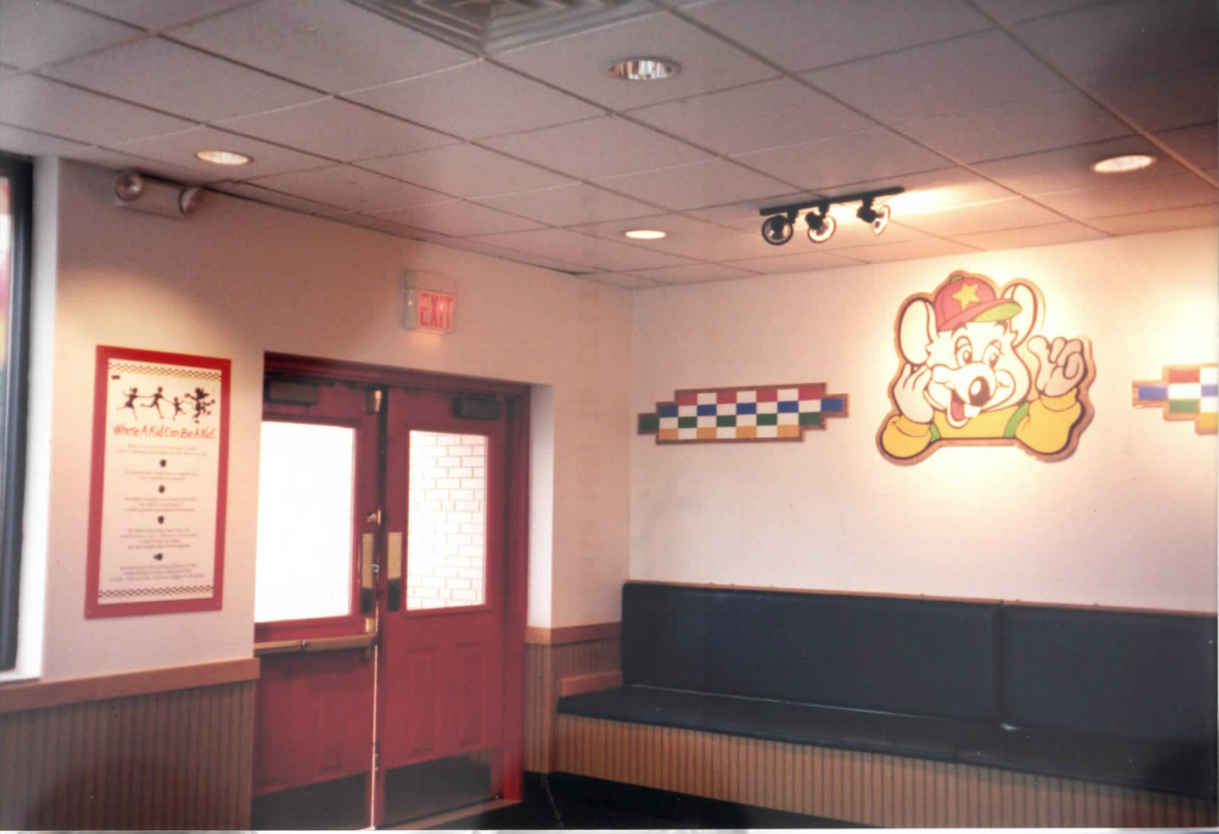
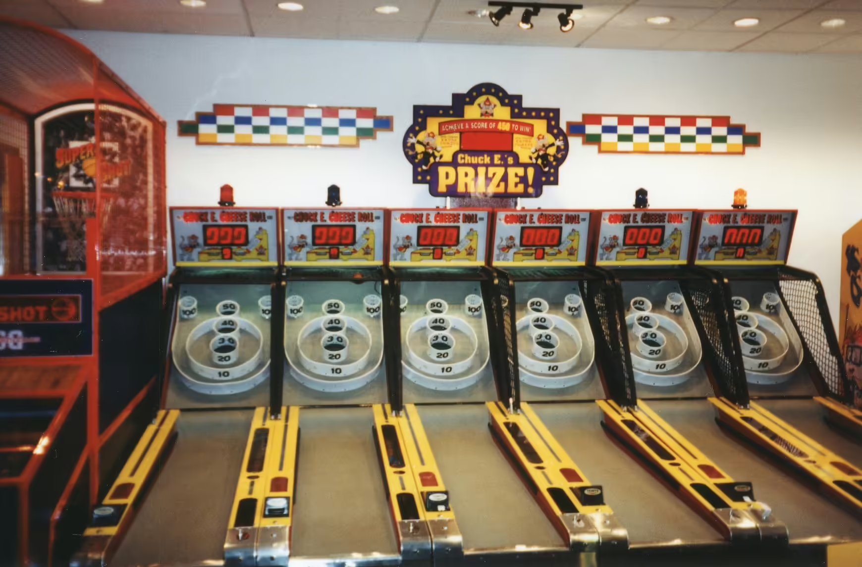
Locations were fitted with subtle rainbow carpeting, theater lighting, and crown molding with indirect rainbow-colored lighting. Wooden signs were introduced within locations to denote areas and attractions, along with an updated décor package which were showcased by spotlights throughout the store. Wooden signs and décor used in the remodel can be found in :Category:CEC Art Packages|CEC Art Packages, under the following sections:
- 1993-1996 Décor, Signage, Magazines (Graphic Décor predates the remodel initiative)
- 1998 Graphic Décor, Signage
- 1999 Graphic Décor, Signage
- 2000-2001 Postcards, Signage
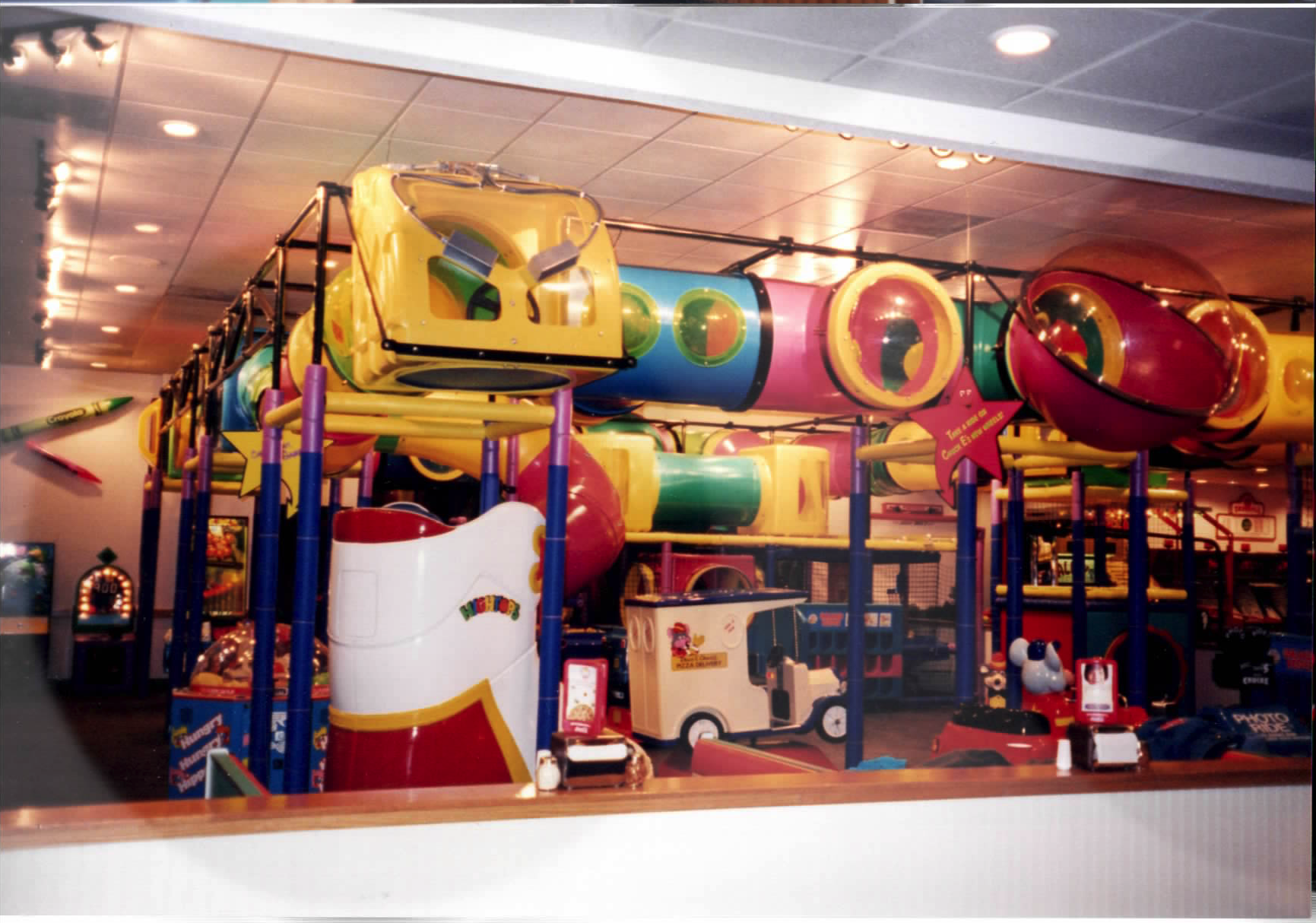
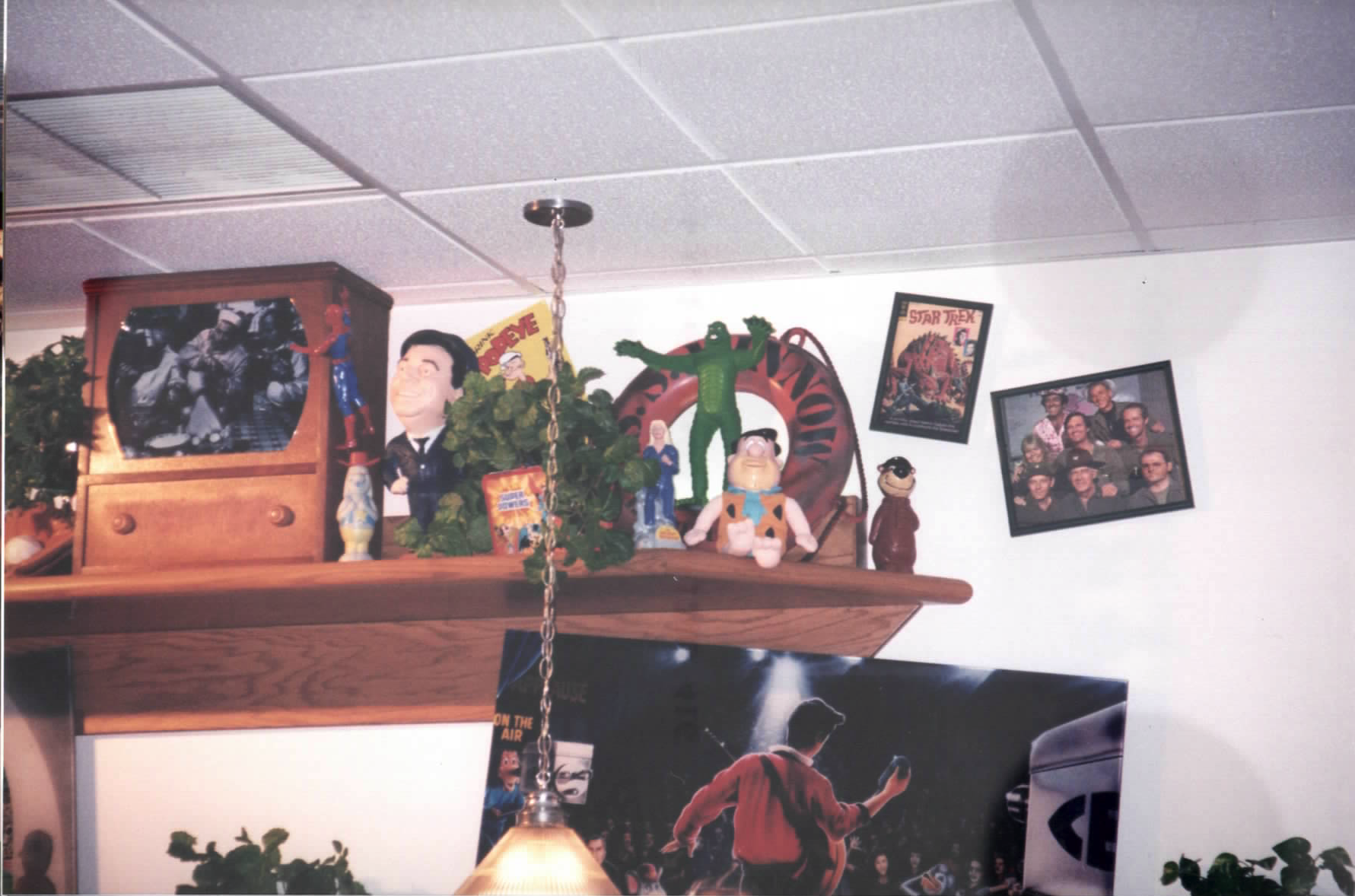
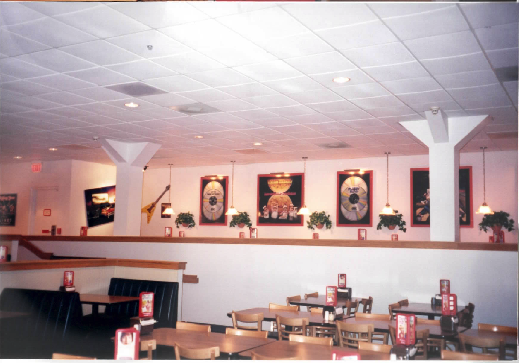
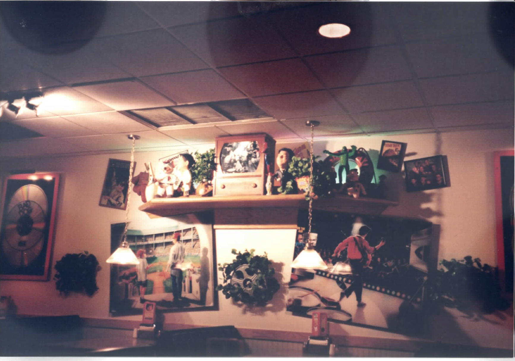
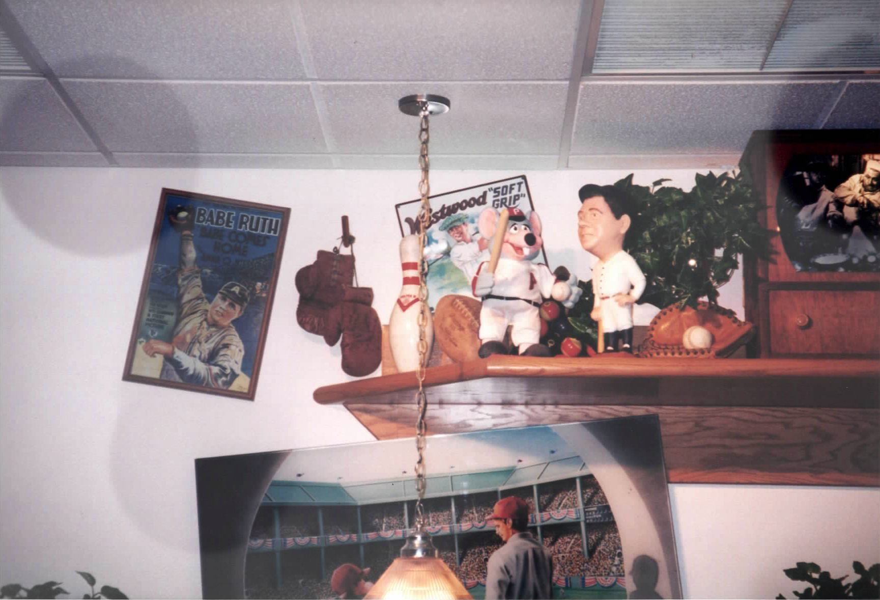
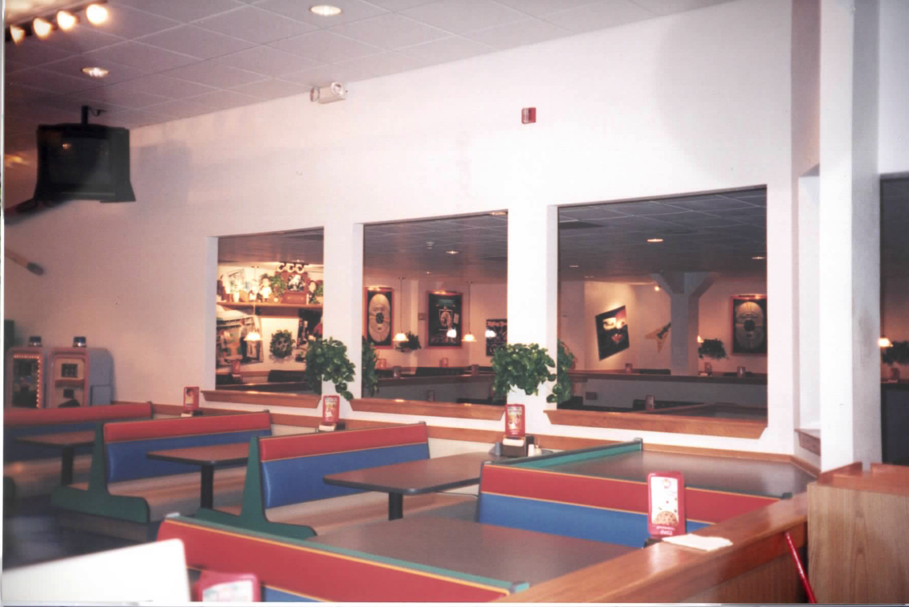
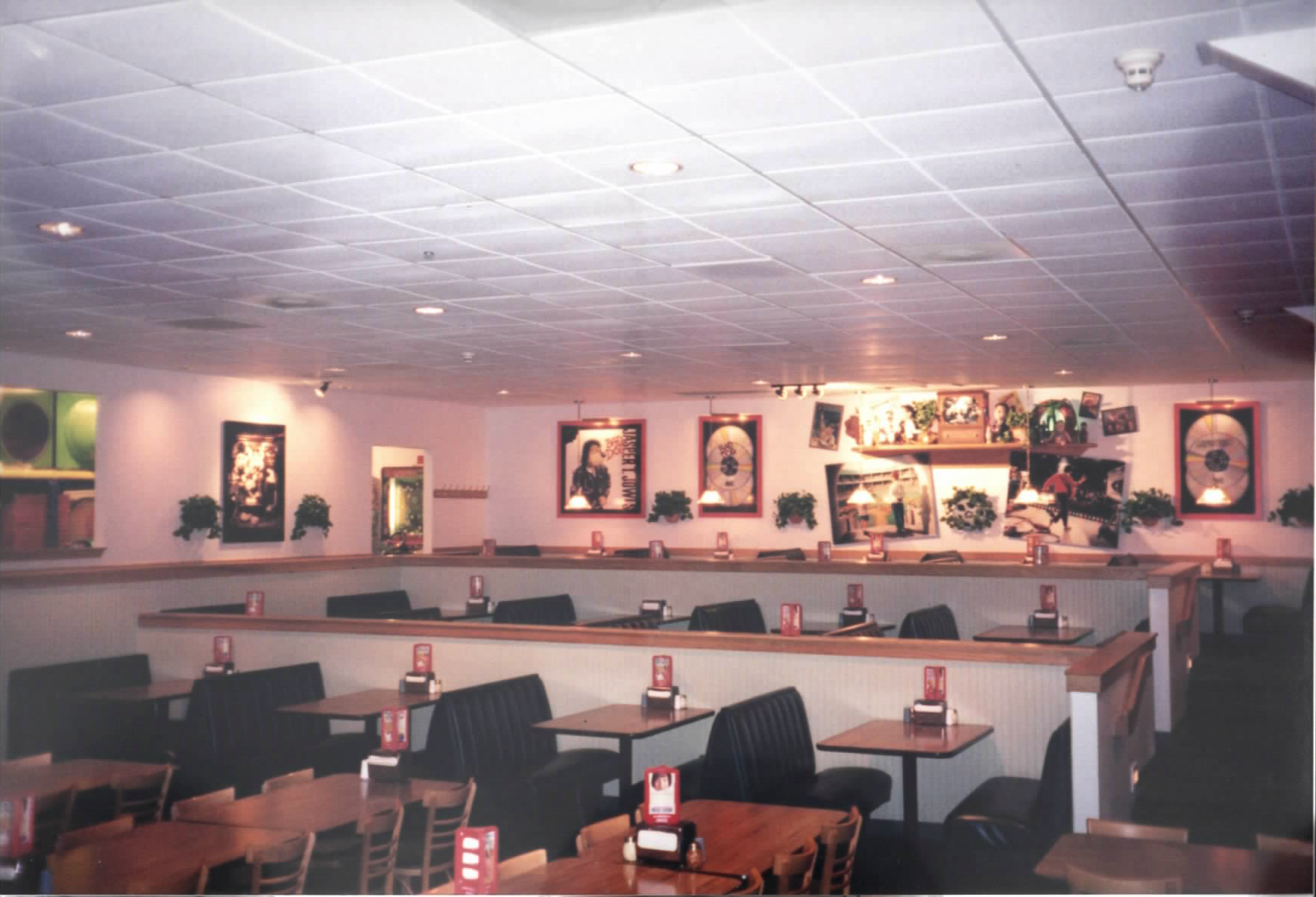
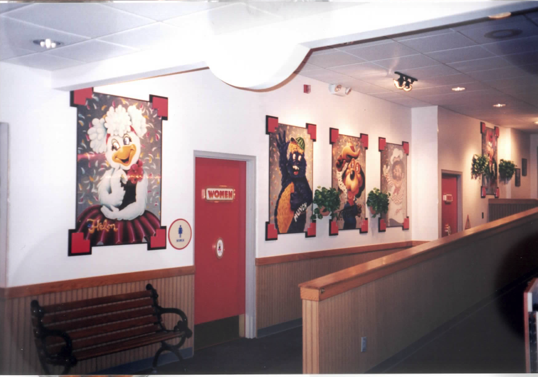
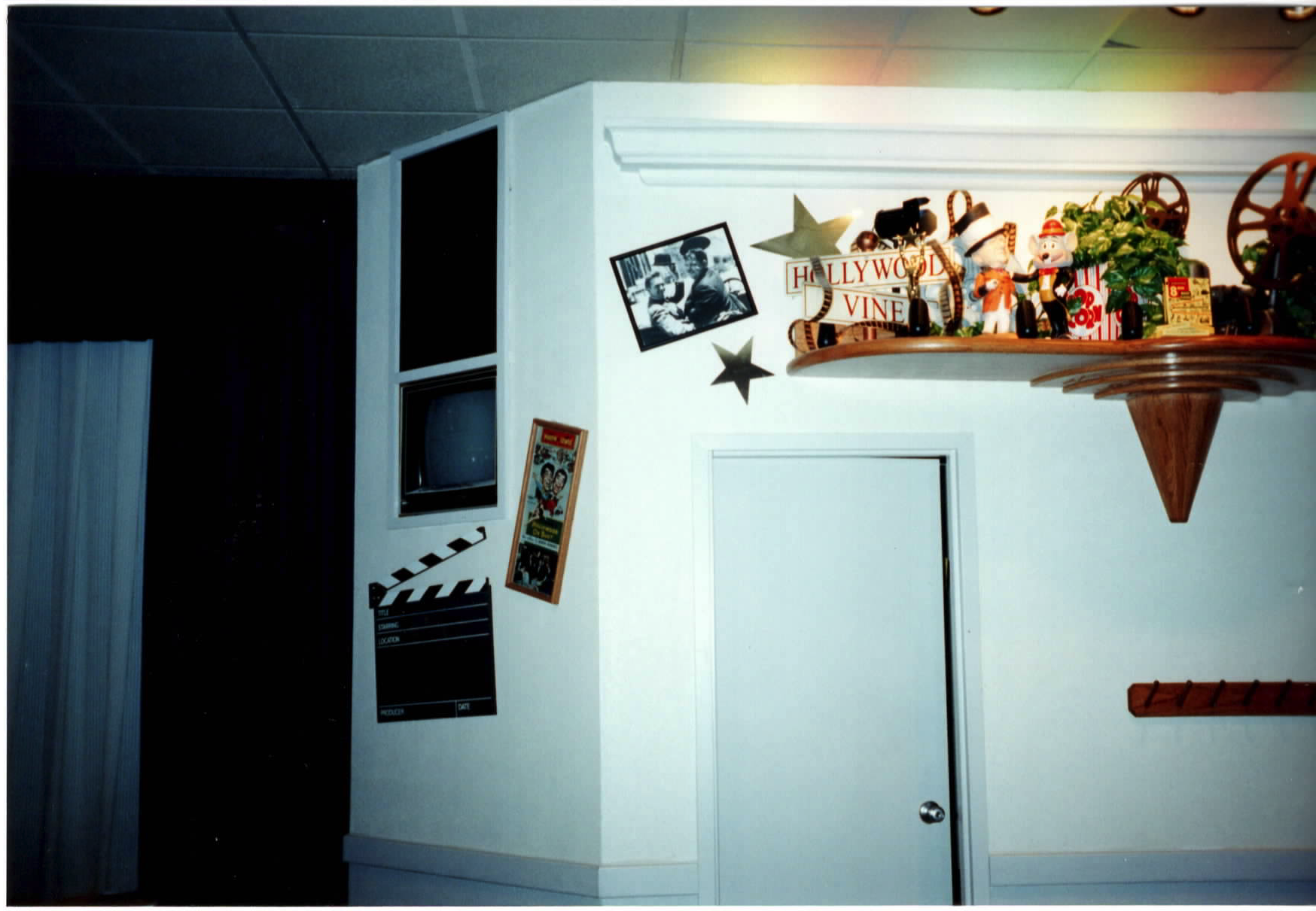
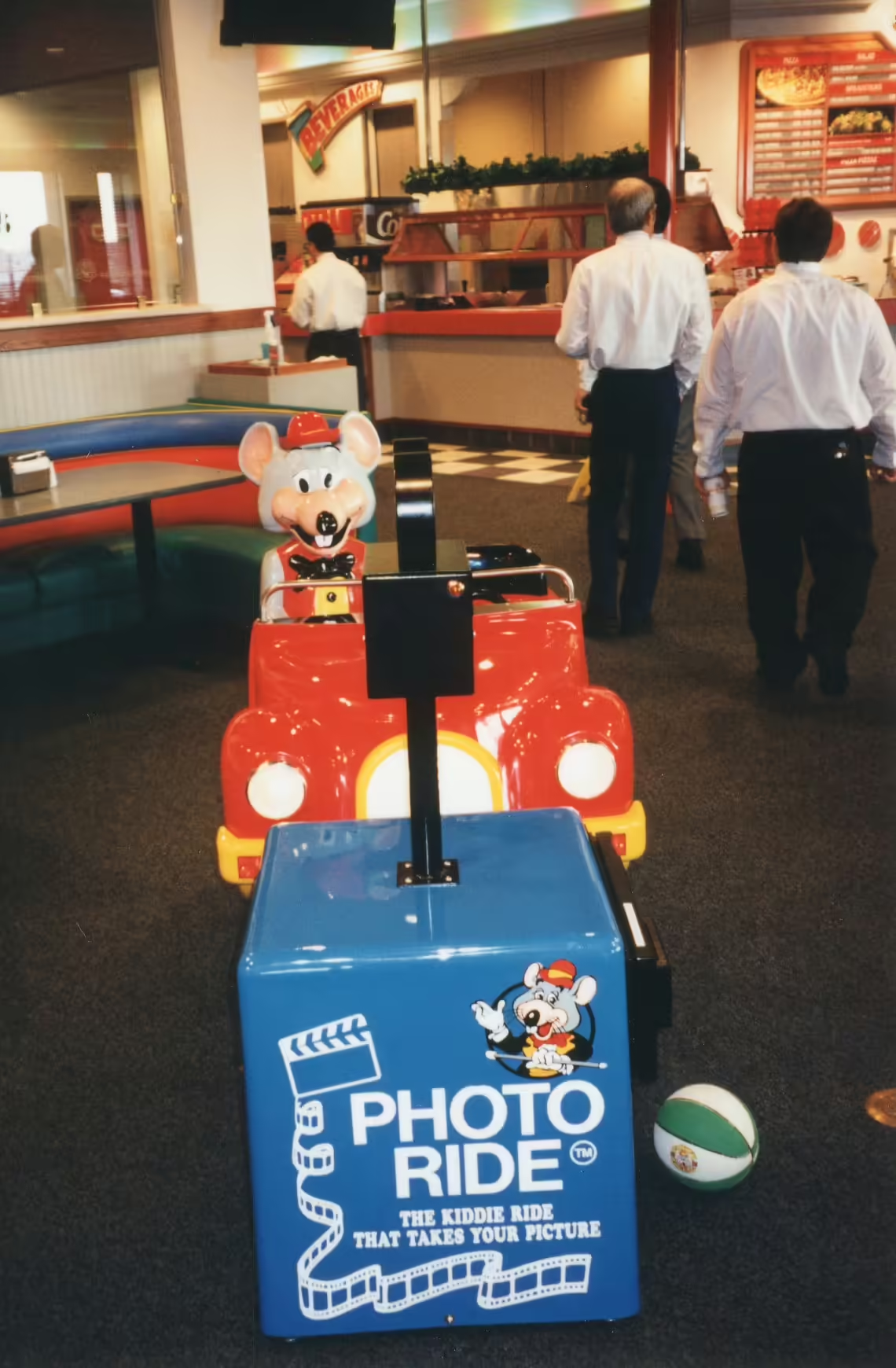
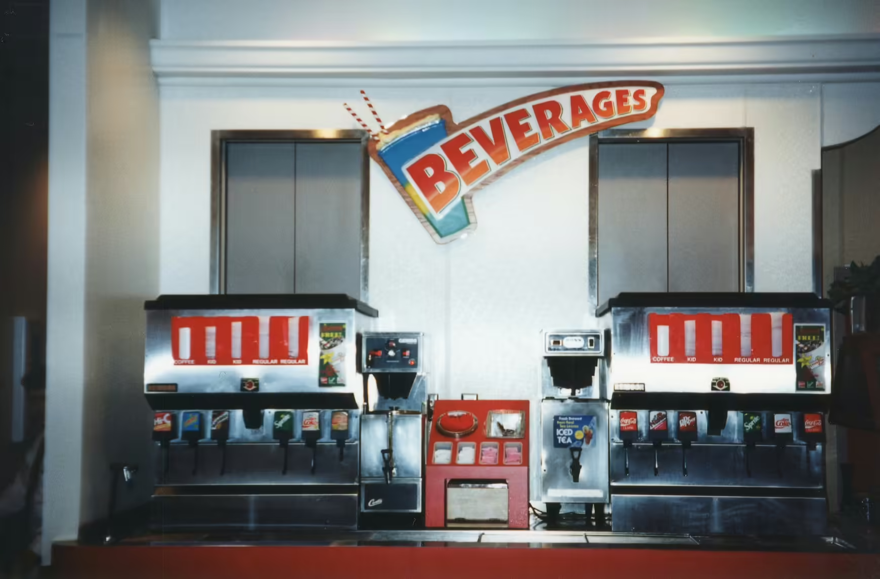
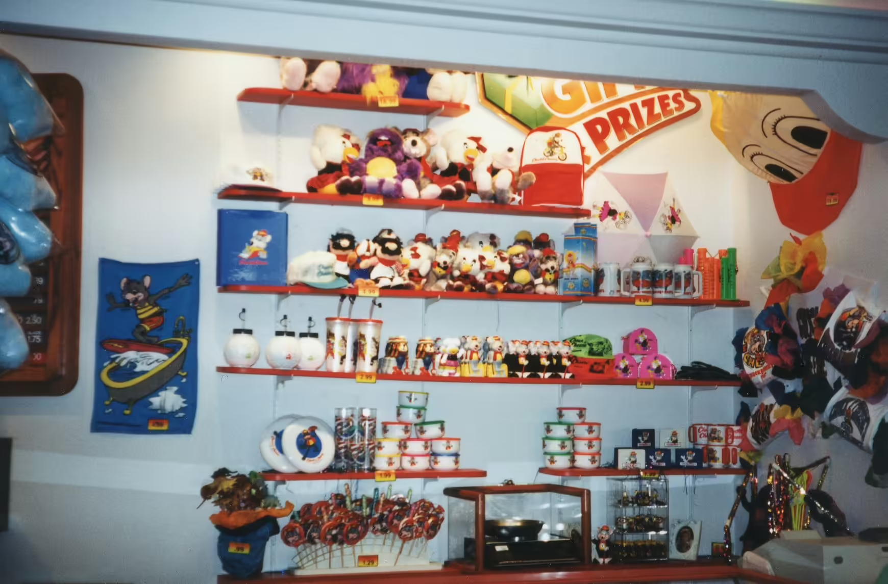
In the gameroom, new booths were introduced which had light wood textured seats with vibrant red and blue back cushions, and a vibrant green front. Tables were made of gray laminate. To separate rows, light gray wood paneling was used with a natural red wood trim. In the showroom, new booths and chairs were introduced, which were black with muted green cushioning. Tables were made of light wood textured laminate. Additionally, the showroom begun to feature Artifact Shelves which consisted of retro and pop-culture décor. These shelves were placed on both sides of the stage. Lastly, the ordering counter, prize counter, beverage selection, and salad bar areas were enhanced to match the overall appearance with wooden signs replacing the previously used neon signs and interior awnings being removed from each section. The below images come from Irving, TX (3903 W Airport Fwy).https://www.instagram.com/p/CTTHrg8JmWk/[4]
Installations
| Location | Installed |
|---|---|
| Huntington Beach, CA (15511 Edwards St) | ? |
| Charlotte, NC (7701 Pineville-Matthews Rd) | ? |
| St. Louis, MO (2805 Target Dr) | ? |
| Cincinnati, OH (8801 Colerain Ave) | 1992 |
| Sharonville, OH (1429 E Kemper Rd) | Sep. 8, 1992 |
| Patchogue, NY (121 Sunrise Hwy) | 1993 |
| Lexington, KY (1555 New Circle Rd) | May 1993 |
| Pearl City, HI (850 Kamehameha Hwy Suite 140) | Nov. 1994 |
| Commack, NY (2115 Jericho Turnpike) | 1995 |
| Montgomery, AL (2940 E South Blvd) | 1998 |
| Cincinnati, OH (4394 Eastgate Square Dr) | 1998 |
| Florence, KY (7635 Mall Rd) | 1998 |
| Houston, TX (6760 Antoine Dr) | Aug. 23, 1998 |
| Scottsdale, AZ (8890 E Indian Bend Rd) | Sep. 1999 |
| Sterling Heights, MI (13745 Lakeside Circle) | Feb. 2, 2000 |
| Portage, MI (6175 S Westnedge Ave) | Sep. 26, 2000 |
| Bayamon, Puerto Rico (Rexville Town Center) | Jun. 2003 |
| Jackson, TN (2021 North Highland Ave) | Jul. 30, 2003 |
References
- https://www.showbizpizza.com/info/documents/cec/cec_annualreport2001.pdf
- https://www.showbizpizza.com/info/documents/cec/cec_annualreport2002.pdf
- https://showbizpizza.com/videos/cec/promo/cec_fyi.wmv
- https://archive.org/details/irving-tx-remodel-001/
- https://www.showbizpizza.com/info/documents/spt/spt_93annual.pdf<
Numbered in the order they appear. Reference in article text with .
Fields here update the page's metadata. All saves go through a pull request for review.
Location-specific fields: store info, coordinates, animatronics, remodels, stages, etc.
Showtape-specific fields.
Product-specific fields: pricing, sales records, manufacturer info.

![[[Artifact Shelves]] and updated showroom booths with planters.](/photos/X5Kkj2cR4FeElqkmOZo3.avif)

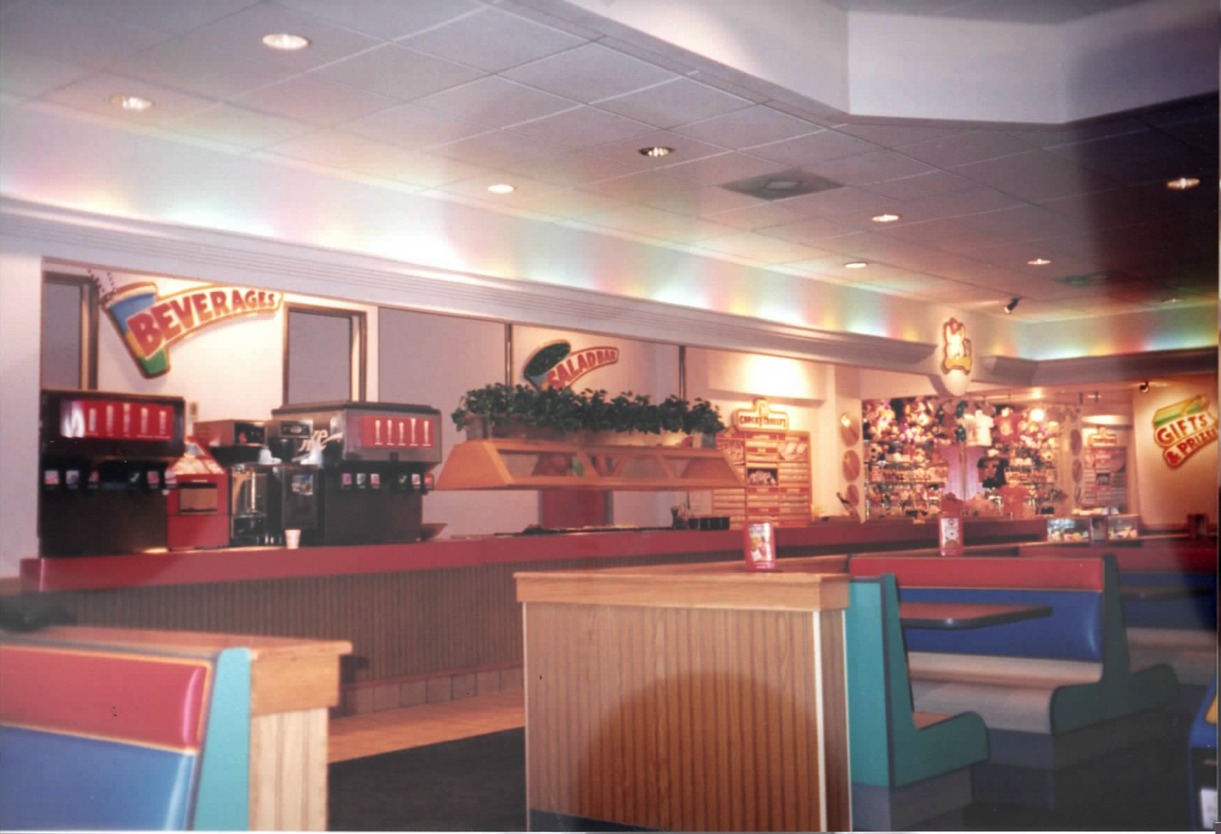
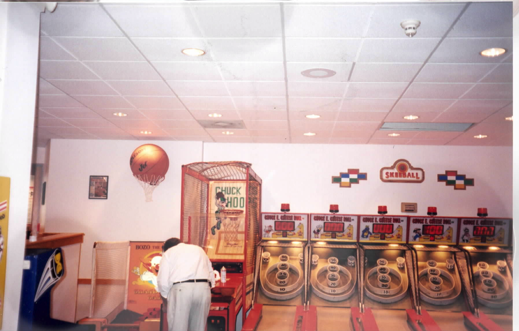
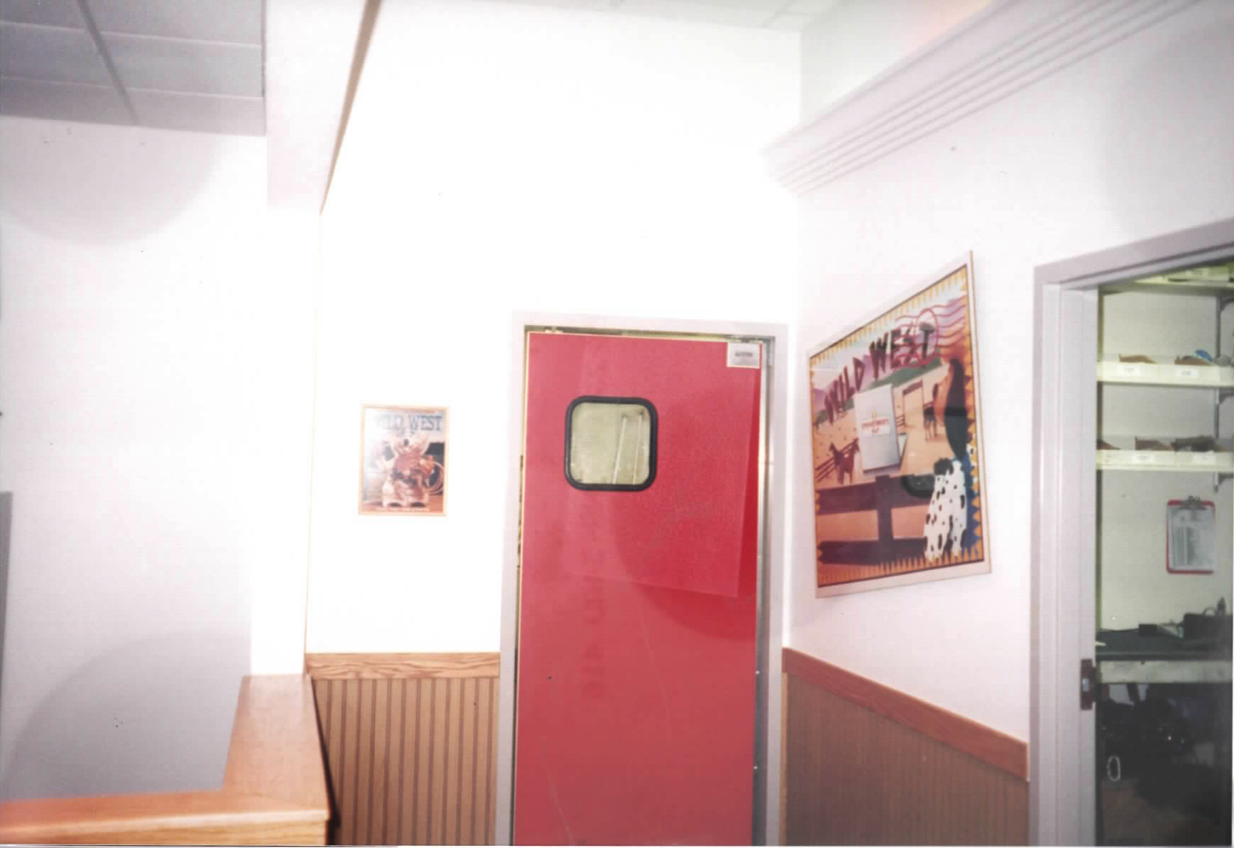
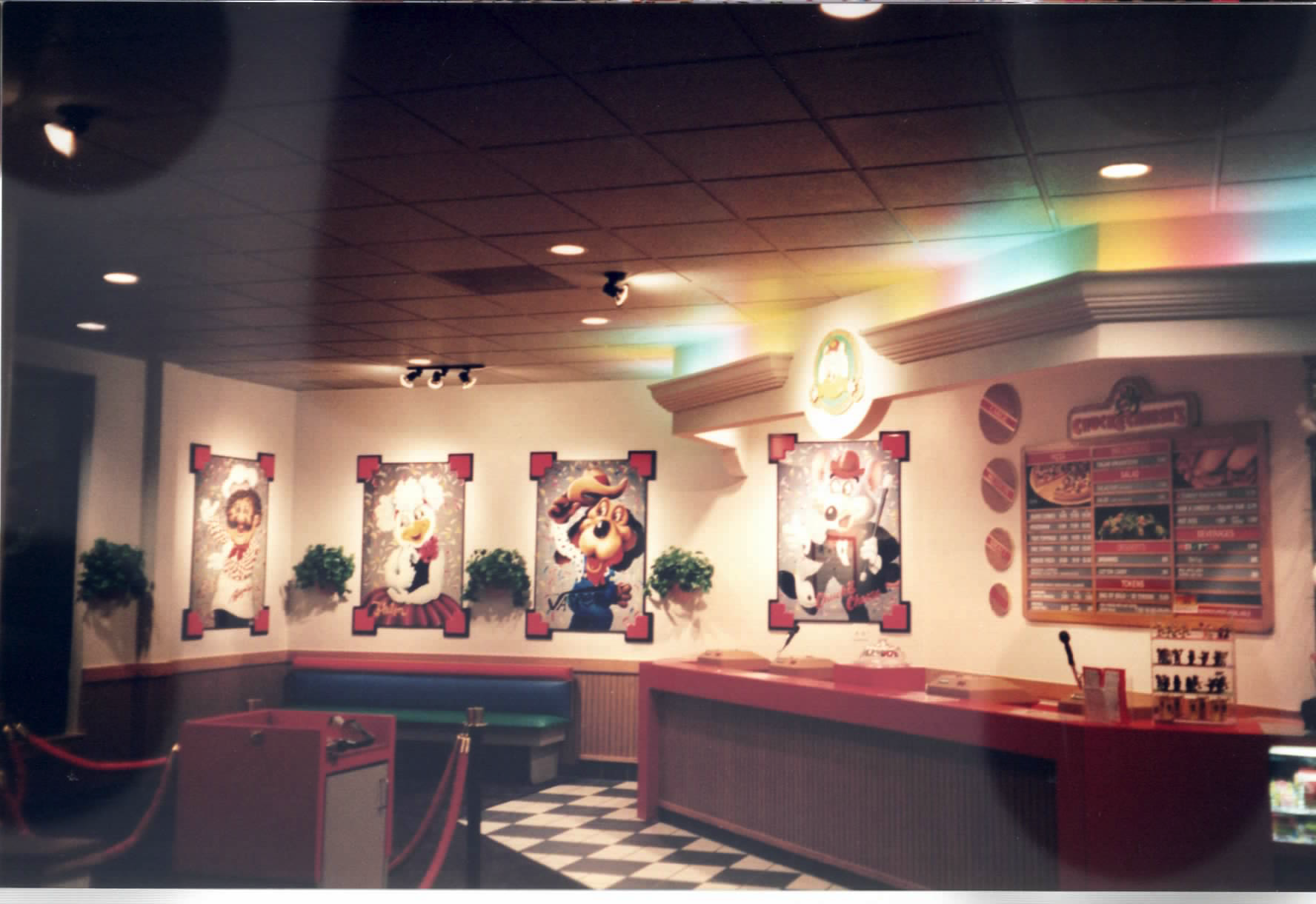

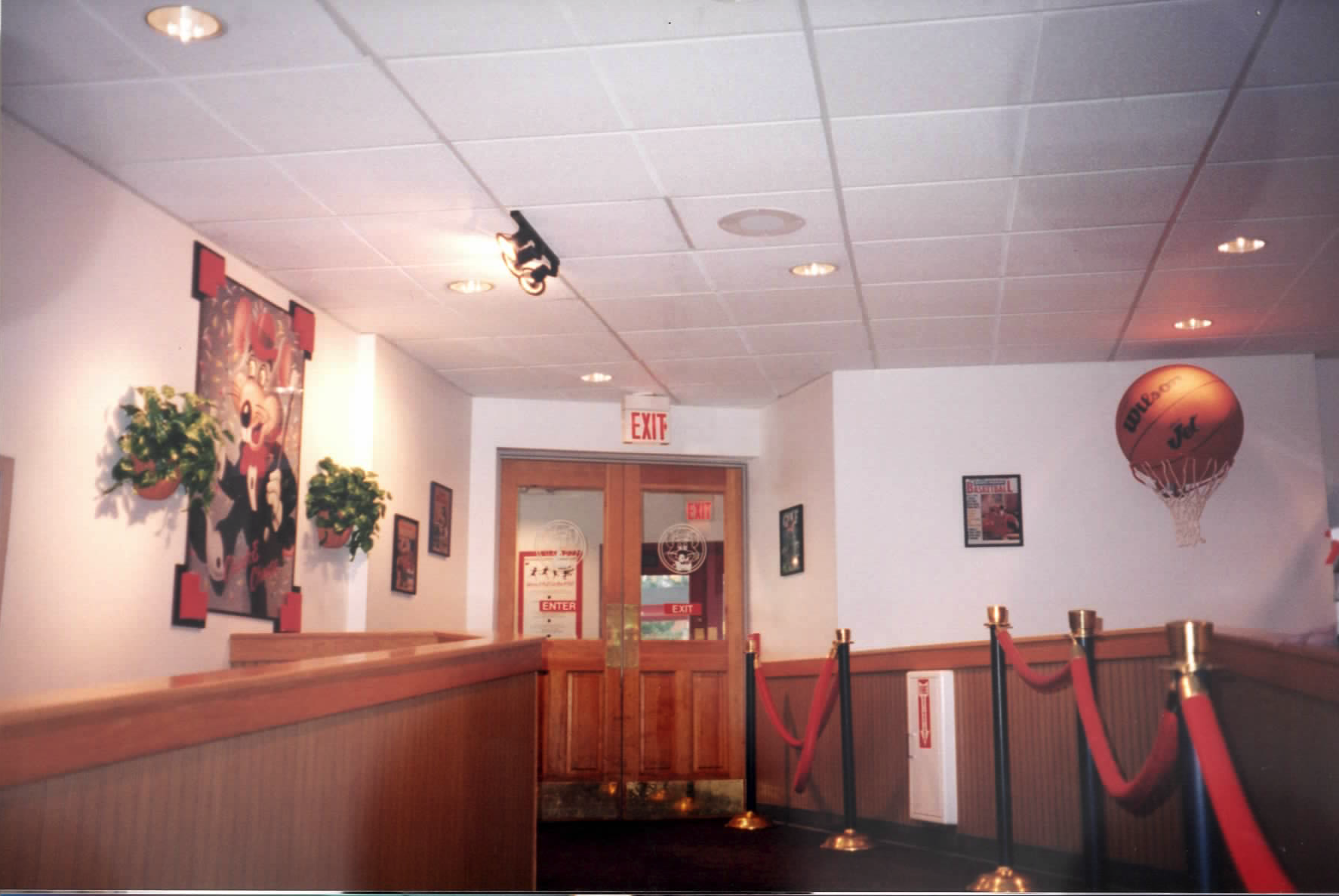
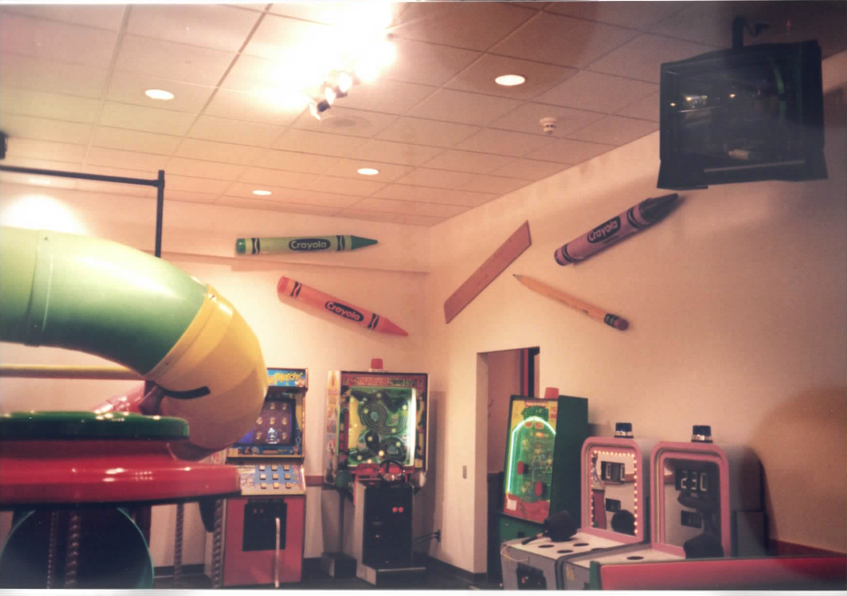



![Refreshed gameroom with [[Phase 1 (1994)]] elements, and indirect rainbow lighting with crown molding.](/photos/I288FpQDekBZ9GeGsv3X.avif)
![New parody posters: [[1993 Cheese Z Top (CD Award)]], [[1994 MC Chuckie (CD Award)]], [[1994 It's A Dawg's Life (CD Award)]]](/photos/ThQ_r0AT9h30UCILebFe.avif)
